
Designing a Basic Brand Identity (Logo, Colors, Font)
When you hear the word “brand,” you probably think of big names-Apple, Nike, Coca-Cola. But here’s the truth: even the tiniest local café or a new freelancer needs a brand identity. Why? Because it’s what makes people remember you.
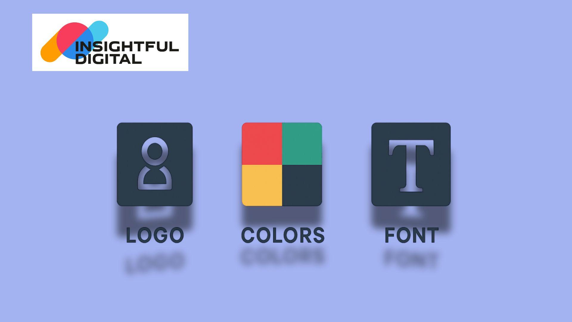
And honestly, you don’t need a 50-page style guide to start. The basics are simple: a logo, some colors, and fonts. That’s it.
Logo – More Than Just a Picture
Your logo is like the face of your business. People will see it on your website, receipts, maybe even on someone’s T-shirt. If it’s confusing or cluttered, it won’t stick.
Here’s the trick:
Keep it simple. (Think of the Nike swoosh.)
Make sure it fits your business vibe. A cupcake shop doesn’t need a futuristic robot logo.
Don’t chase trends too much. You don’t want to redesign every two years.
And no, your logo doesn’t need to cost thousands of dollars. Even a clean wordmark can work wonders if it feels right.
Colors – The Emotion Part
Colors do something words can’t: they set the mood instantly.
Think about it-banks love blue because it feels trustworthy. Eco brands go green. Fast-food chains use red and yellow because they make you feel hungry and energetic.
You don’t need a giant palette. Just pick:
One main color (the star).
One supporting color.
A couple of neutrals (black, white, grey).
Consistency is the secret here. If your Instagram post, business card, and website all “look” like you, people start remembering your brand without even reading the name.
Fonts – The Voice of Your Brand
Fonts are underrated. But imagine a law firm using Comic Sans-it would look like a joke, right?
Your font is basically how your brand speaks when it writes.
Choose a main font for headings (something bold, clear).
Pick a second font for normal text (simple, readable).
That’s it. No need to go wild with five different styles.
Tying It All Together
At the end of the day, your brand identity doesn’t have to be fancy. It just has to be consistent. Same logo, same colors, same fonts-everywhere. That’s how people start recognizing you without even trying.
And once that happens, congrats-you’ve built a brand.
MCQs (with correct answers marked)
Q1. What is the first step in creating a brand identity?
a) Choosing a font
b) Designing a logo ✅
c) Selecting color palettes
d) Creating advertisements
Q2. Which element of brand identity helps in evoking emotions?
a) Logo
b) Tagline
c) Colors ✅
d) Website
Q3. Why is font important in brand identity?
a) It increases product price
b) It improves website ranking
c) It defines brand personality and tone ✅
d) It boosts sales automatically
Q4. A strong brand identity should be:
a) Confusing
b) Consistent ✅
c) Expensive
d) Trendy only
Q5. What combination completes a basic brand identity?
a) Logo, Colors, Font ✅
b) Logo, Product, Sales
c) Fonts, Ads, Discounts
d) Website, Blogs, Offers
Stay tuned for our Next Article Day 17: How to Create a Minimum Viable Product (MVP)